Sunday, October 28, 2012

Marni + H&M Men's RTW Spring 2012

                                                                           
Collaborative capsule collections between a House and a large retailer: what's the point?

No really, I'm critically asking, but not criticizing. Think: The Webster for Target, Jeremy Scott for Adidas (see my winged marble hig-top post), the yearly (insert designer) for H&M and to a lesser extent Thom Browne for Brooks Brothers (Black Fleece). They are curious things.  From a financial standpoint, ostensibly both sides of the collaborative sartorial coin stand to gain monetarily.  Gains come from increased market exposure to consumers who might have been otherwise priced out.  It perhaps provides a challenge to both sides to design for a certain price point while retaining the essence of the premium brand's character.  But does the premium brand suffer by going too downmarket? Does the mass market retailer suffer by embracing something faux-upscale, thereby rendering the rest of their merchandise not special? 

After politely acknowledging the self-referential irony and whimsy of the Versace for H&M collection, and just window-shopping, I was unsure about the Marni for H&M collection. Marni's quirky esthetic, the peculiar prints and color palette (mud browns, not-quite-navy, pea green, and is-it-red-or-is-it-orange) never appealed to me.  But presented with an opportunity to introduce the brand to new prospective buyers at an accessible price point, one never knows what direction the designer might take: go ultra avant-garde (unwearable), or play it very safe (boring).  I am referring only to the men's pieces, for the record.  

The Marni for H&M collection was mostly yawn and head-scratching-worthy. The half rain-jackets? I'll wear that when it's, um misting?  The long coat with 10 trillion pockets and Little Red Riding Hood hood? Uh, what. The prints looked like a child had made them with a stencil, etc.  And the socks? Well those were the answer to a question that nobody asked. There were two pieces (ok, the suit counts as two + a coat, makes 3), that I found to be clever, wearable, and interesting.  The long (actually navy) coat with sweater sleeves was new enough that it would stand out from a normal long quasi-trench, but normal enough that I could actually routinely wear it and pair it with normal clothing, i.e. a navy suit underneath.  The striped suit was also of interest in that it was made from an interesting almost selvedge-like material and had some interesting tailored details: seams along the inside of the arms, and along the outside of the pantleg in particular.  I chose the pants vice the shorts because, uh, I can't wear dress shorts to work. I tried on the light blue dress shirt with the navy collar. But even in my size, the fit was peculiar.   Oh, I bought these months after they came out on the sale rack for about 75% off.  I am a big guy so it appeared, fortuitously, that the only sizes that did not sell were the sizes that fit me perfectly.  Also on the sale rack were dozens of the atrociously-weird non-symmetrical colorblocked sweaters in every size. Even discounted to USD 19.95 I still said no thanks.  That was a miss there on that garment.  


The most unique piece from the whole collection for men. 
Looks best with the collar flipped up.


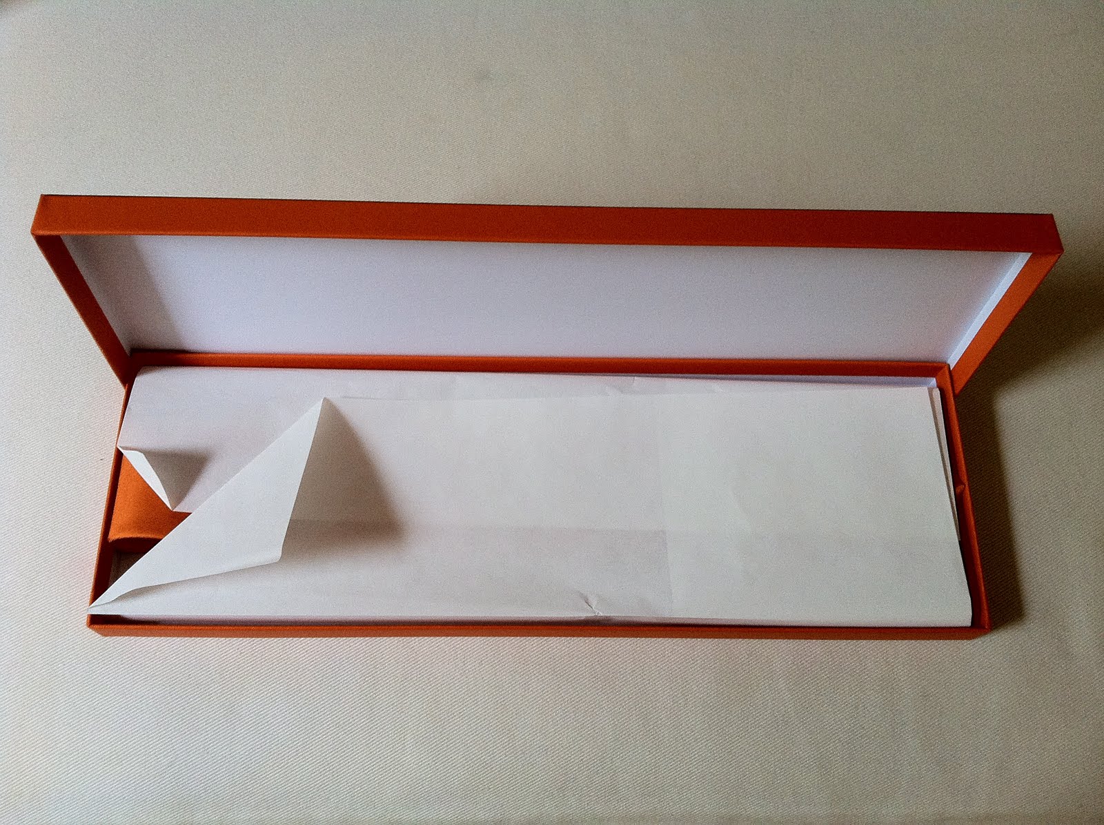
As always, the packaging it unique and come with the garment(s). 
So what's the point: does this collaborative capsule collection, whether purchased at retail and/or discounted prices cheapen the Marni brand? Does it elevate H&M's reputation for steadily-increasing quality tailoring, fit and finish of their "higher" end clothes? Probably not, and probably yes, respectively.  

But then again, to paraphrase Charlie Bucket, "It's candy*, it doesn't have to have a point.
*fashion

Monday, June 18, 2012

Marni + H&M Spring 2012

After a long hiatus, several updates are coming very soon...starting with Marni + H&M.

Monday, August 8, 2011

LANVIN LOVES ACNE Capsule Collection F/W '09 Denim High-Top

For the 2009 F/W season, LANVIN collaborated with Swedish brand ACNE for a capsule collection (we're saw further 2009 and 2010 resurgence collections) that employed the sharp deconstructed tailoring of Alber Albaz with ACNE's expertise in the denim sphere.  A gem from this collection was this pair of high-tops in the style has made its way into the men's RTW collection every year since.  These appear to be dark blue but they are in fact dark grey with black patent piping.  The black waxed laces are a nice detail.  I get a lot of mileage out of these as they go with practically everything.  Think grey tailored shorts, black spiked belt, white tshirt, black puffer vest, black Ray-Ban Wayfarers.   


Saturday, July 9, 2011

PUMA Mens RTW F/W 2010 URBAN HILANDER by Hussein Chayalan

Great Scot Marty!  

If these leather and plastic sneakers don't immediately make you think of Biff's BMW 633 from Back to the Future II (see the last photo if you don't believe me), then....you haven't seen enough sci-fi movies and/or need to work on your tangential mental reference connections.

As was the case with the marbled Jeremy Scott Adidas sneakers (one of my original postings), these caught my eye as something truly special and that weren't readily recognizable as Puma.  Out of what I consider tired and juvenile designs, I usually ignore Puma except for their occasional collaborations.  With these, designed by Puma's Creative Director Hussein Chayalan, even the brightest light, the trademark side design is all but completely hidden.  These look throwback and hyper-futuristic all at the same time.  

Trad, meet the future indeed.


German-spec BMW 633 CSI from Back to the Future II

Saturday, June 25, 2011

HERMES Men's Permanent Collection Solid Orange Silk Tie

I'm writing this at around 0100 in the morning in the D gates section of American Airlines terminal in Dallas Fort Worth International Airport.  The terminal is vacant save for the cleaning crews, who through their sweeping, dusting, mopping, and floor shining give the impression of bustling, industrious nervous insects preparing their hive for the impending arrival of their queen... 

I have an aversion to articles of clothing and accessories in certain colors, namely orange and purple, colors opposite each other on the color wheel as it turns out.  (This aversion extends to a lesser extent to green and yellow. ) This goes for all shades of orange and purple, from burnt umber to eggplant, respectively; these colors almost universally visually repulse me.  It has nothing to do with these colors not matching my skin tone, or my personal seasonal aesthetic (are you a winter or a fall? Answer: What does that even mean?)  
That said, I told myself that if I ever did feel compelled to purchase something in either of these two colors, it would have to meet a certain set of criteria.  Namely orange or purple would need to hold some special significance to the brand in question.  The article or accessory would need to be completely orange or purple, else it would appear as if I was trying to mask the fact that I had made a purchase that contained a little or a lot of two colors I loathe, almost as if these colors were afterthoughts or incidental.  

I had been contemplating purchasing something Hermes for a long time.  For me, my first purchase from a brand has to be something classic, something the brand is known for because they do whatever it is that I'm purchasing, the best.  I'm not a scarf guy--they're too fussy, too delicate, and too costumy.  This isn't to say I don't appreciate scarves, especially by Hermes.  On the contrary; they're just not my look.  An eight of an inch of precisely-folded solid white pocket square protruding from a suit pocket is as far I venture into that realm.  

It goes without saying that Hermes is known as much for their exquisite neckties for men as they are known for their Birkin bags for women.  Specifically, Hermes is known for their whimsical, collectable, and instantly-recognizable patterned silk neckties.  This color is whimsical and daring enough for me, along with being the Hermes signature, and so this is what I chose.  Just what the doctor ordered, a birthday present to myself as it were.  The buying experience was exceptional.  Although I made it known I was just in the market for a simple silk tie, the sales associate treated me as if I was entertaining the notion of purchasing several ready-to-wear pieces.  Multiple associates assisted in the packaging and the ultimate presentation once the transaction had transpired.  

I expect to pair this tie with a crisp white slim-fit dress shirt, khaki slacks, a light brown belt and loafers.  You can expect to see a picture of the same shortly as I aim to start photographically documenting some of my complete looks.


Saturday, May 28, 2011

PRADA Men's RTW S/S NYLON ACTIVE TRAINER 2010

A short sign-of-life post.  I've been galavanting around without my computer and have been neglecting blogging about recent and not-so-recent (but have yet to be worn) acquisitions of interest.  Many more postings are ahead in the coming weeks.  

I purchased these trainers in the Summer of 2010 at the Prada SOHO store, (which merits its own post at some point) and I have been searching ever since for the more widely-known ugly-beautiful orange and green version.  Everything about these shoes works perfectly from a visual aesthetic perspective, which is an exception to the rule for Prada.  I'm ambivalent about whether or not it's a good or a bad thing as proportions are all garment and shoe-specific.  In the case of these trainers however, these mostly fly under the radar---unlike say, the Espadrilles whose soles came this very shoe.  Suede, nylon, plastic, rubber, leather: these fetishistic components have been amalgamated in a wearable, classic shoe.  Note, I almost bought them in sky-blue before settling on the modern grey and silver.  


I almost left with these--this was taken in the Madison Avenue Store.